Wednesday 30 March 2011

Audio Clip


Squarepusher - Kill Robok

The idea is to create an animation that fits with the audio. After listening to it over and over again i started to create a spider diagram of words which came to mind whilst listening to it.
Here's a few:
  • Metal
  • Clash
  • Raw
  • Tapping
  • Electricity
  • Sparks
  • Cold


New Project: Print to Pixel

My new project is focusing on animation. I have to got create a 20 - 30 second animation based around an audio clip. I have never ventured into the realms of animation before what so ever so it will be interesting to see how i get on!

From the piece of audio we are to think of 3 words which would link to it, my clip uses a lot of metal crashing and banging elements so they will be the sort of things which i will be looking at at first.

The first part of the project is to create a storyboard from our ideas to show how our animation will pan out and if it will actually work effectively.

Monday 14 March 2011

Finished Poster

This i my final finished poster for task 2: 100 years of gf smith paper. I am very pleased with the overall finish. After considering every thing i chose to go with a simple font which is why i chose Helvetica, it works well with my chosen image. It is a very different approach to the paper folding techniques used in task one as i used a scruffy old book when creating my folds rather than pristine paper, but it turned out as i wanted it to.

A Few Experiments For My Poster

I've used a few of my images from experiments which i carried out to create a few different poster designs and layouts. Some of them i'm not as keen on as others.


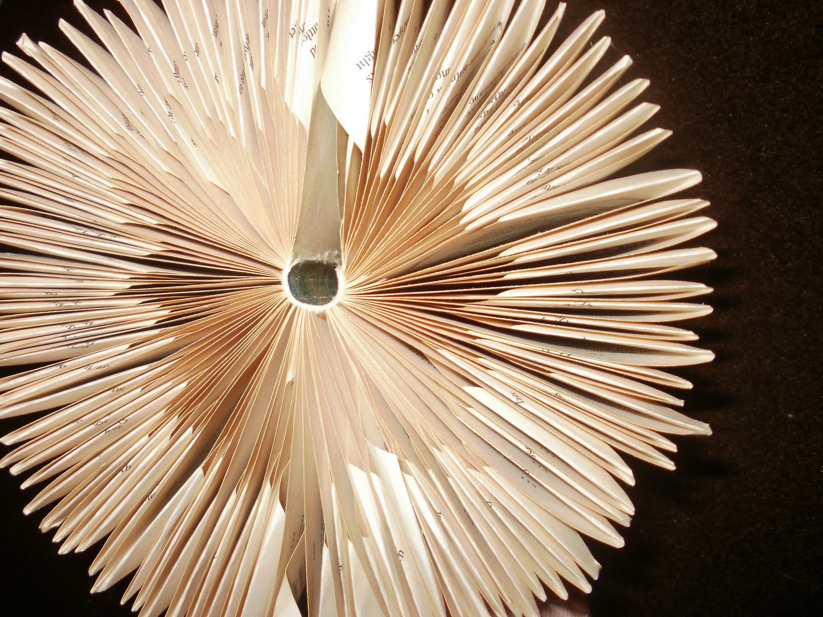
This one was created from the cut away experiment i did. I think that its quite effective however im not that keen on the computerized type at the bottom of the page.


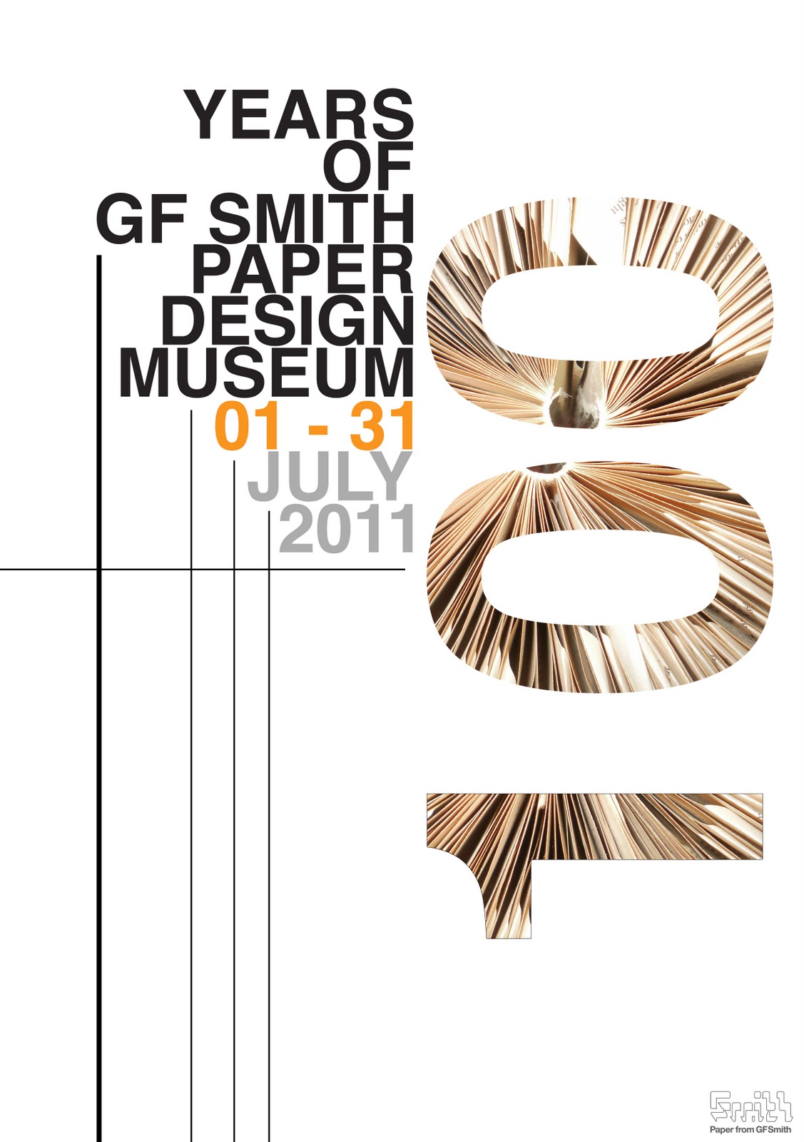
I think the poster is quite effective, using the folded book image. I tried using the grid structure idea to create it, and also altered the opacity of the '100' section.

These two posters are based upon one of the posters shown on a slide in one of the lessons. I quite like it and think it was improved by making the images more see through.


 Then i went on to place the folded book image within my text, i'm really pleased with how this looks and want to develop it further by adding extra elements which add to the grid structure.


I added the lines which help with the grid structure and add an extra element. I also started looking at the colour of the type, whether to have only certain parts coloured or all of it. Then finally i placed the gf smith logo in the bottom right hand corner, i experimented putting it in others places (shown in my sketchbook) but overall i preferred it in the right corner.


I think this poster design has a good balance with the colour and grid structure, i wanted to use a orangey / yellow colour as it tones in with the image within the '100' section.

Final Piece Photos Task 1

So here's some photographs of my final piece, i tried using different lighting techniques and angles to achieve a range of finishes. Due to the flash on the camera i couldn't quite achieve the desired look, but i came pretty close.


I am really pleased with how they turned out. I wasn't quite sure whether to include the gold stars or not so i took photographs both with and without them. I think in a way that they work better just white rather than adding colour.

After getting into doing this project i started to enjoy it, i am looking forward to creating my poster for task 2 as that is something which i enjoy doing.

Monday 7 March 2011

Experiment for task 2 continued..

Task 2 is to create an A2 poster celebrating 100 years of the GF Smith paper company. We are to include the techniques which we learnt during our experiments for task 1.

From looking at artist peter callesen's work it gave me an idea to try standing type up off of the page, i really like the idea as you can change the font style to suit the theme.

I like some of the different camera angles and colours achieved, i don't think it would be the look i want to choose for my final poster though!

Friday 4 March 2011

Experiment for task 2

I got the idea to do this from watching 'The hairy bikers'. They went to visit a place and this was one of the things they did. So i got an old book and thought I'd try it out for myself. Its meant to look like a Christmas tree however from one angle i think it looks more like a mushroom!


Initially i left the book cover on for the first few photos but then took it off to reveal a cone effect.


This is the image i think resembles a mushroom!


I really like the colouring of the pages, at the top and the bottom where the book has aged it has a richer warmer colour. Its also very effective where the book has been folded making it brighter towards the outside compared with the inside layers.

Su Blackwell is another artist who works with paper and especially books. She made a series of book sculptures, cutting-out images from old books to create three-dimensional artwork.

Pandora Opens Box
 The Old House

Two tubes of super glue later...

So here's some photos i took straight after finishing putting together my final piece. In the end i created one large star, 3 medium and 4 small. I have still got to hang and photograph them properly to achieve the desired finish.


Many hours of having my fingers super glued together but i think it was well worth it and am very pleased with the results, i just hope the proper photograph turns out ok!!

Snowflakes?

This was just a little experiment towards the poster, i thought about recreating the snowflakes you make out of paper when your a kid, soooo i had a go at it.


This wasn't intentional but i think this looks like 2 human faces staring at eachother.


 I would like to make something which has more detail to it like Emma Van Leest's work.

Yulia Brodskaya

Her work has given me and idea for experiments toward my poster for task 2. When you concentrate on the text you can see all of the separate intricate swirls that the papers creating. Beautiful!


Jen Stark

Jen Stark is a contemporary artist. The majority of work involves creating paper sculptures but she also works with drawing and animation. Her work draws inspiration from microscopic patterns in nature, wormholes, and sliced anatomy. She stands above some of the other paper artist i have looked at due to the fact she doesn't just stick to white paper/card.

Spectral Zenith
 Tri Angular
 Burst
Afterglow

I really think her work is inspiring, to try something new, bold and out there. From looking at her work i would like to experiment and incorporate colour into my paper works.

Thursday 3 March 2011

Final Piece In The Making

From my sketchbook work and research I have developed my final idea and decided to use a net to form the star like 3D object. It is made up of many triangles which fit together to form a ball. I experimented first with very thin printing paper so i could get a feel for how it was going to fit together and if it would actually look how i wanted it to.


I was really pleased with how it turned out so then decided that it would look more effective and much sturdier if it was in a thicker paper or even card. Also for my final piece i am wanting to have several of these star shapes in a variation of sizes so i will need to make my net bigger and smaller to achieve this.


This is a view of my nets, there are 4 separate sections which fit together to form one large net. This image is my first attempt at using a thinker paper/card and at this point already i could tell it was going to be alot easier to put together as it is much stronger and will hold the creases and folds tighter.


This is a plan view of my net i am using for my final piece, i am going to be using 3 different sizes though which i hope will create a nice effect.

I thought I'd take a quick photograph of one of my 'stars' part way through sticking it together, i quite enjoyed this part of the process as i felt i was actually achieving something.

Clive Stevens

Clive Stevens is an English born paper sculpture artist. 
He created his paper sculptures for some of the worlds top advertising agencies between 1985 and 2000.
Since then he has turned his attention to fine art paper sculptures.
 Lord of the sky  
Clive Stevens, Original Paper Sculpture
16 " x 16" x 4"
£1,100.00
 Eric the red -  explorer series  
Clive Stevens, Original 
        Paper Sculpture 28" x 18" x 4"
 Time and tide  
Clive Stevens, Original Paper Sculpture
Pritt stick commercial

Chrip Natrop

So Chris Natrop in an artists who's based in Los Angeles, California. He is well known as an installation-artist that utilizes hand-cut paper. However what many are not aware of is that more recently he has begun integrating a variety of other material into his work. For example transparent plastics, video projection and multi-channel audio to name just a few.

I really love his work, its so beautiful and intricate. It has also given me some inspiration for my poster for task 2.


This is the image which has inspired me the most so far for task 2, i thought something like this which could almost be created by cutting into the paper like when you used to create a snowflake when you were young. So i think i will go on to experiment with this technique/idea, and maybe if you shine a light through it would create a nice effect.